In CSS, you might be confused with box-shadow and drop-shadow. Both of these properties are quite similar, however, there are some differences between them. In this guide, you’ll know the difference between both, box-shadow and drop-shadow with TailwindCSS examples.
Box Shadow in CSS
box-shadowis a CSS property that adds a shadow to the entire box of an element, including any content or padding inside it.- It allows control over the size, position, and color of the shadow.
- It is mainly used to add depth and dimension to a box or to create a visual separation between elements. For example buttons, cards etc.
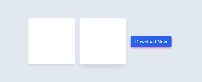
Here is an example of box-shadow in TailwindCSS. You can check the working example of Tailwind playground.
|
1 2 3 4 5 6 7 8 9 10 11 |
<div class="h-screen w-full bg-slate-200 flex items-center space-x-4 justify-center"> <div class="w-40 h-40 bg-white rounded-md shadow-md "> </div> <div class="w-40 h-40 bg-white rounded-md shadow-lg "> </div> <button class="px-4 py-2 bg-blue-600 rounded-md text-white shadow-md shadow-pink-400">Download Now </button> </div> |
Here is the output of the above code.
Drop Shadow in CSS
- Drop shadow is also a CSS property that adds a shadow to the outside of an element, typically beneath it.
- It is limited to the outline of an element and does not include any content or padding inside it.
- It is helpful to create the illusion of a light source shining on the element, causing it to cast a shadow. Drop shadow works best with images.
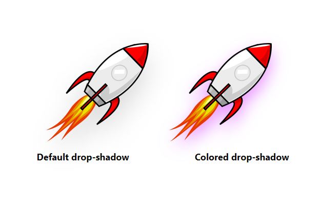
Here is a simple example of using drop-shadow in TailwindCSS. TailwindCSS provides default classes for drop-shadow but you can also use arbitrary values if you want a different effect. Here is a simple example of adding a drop shadow to an image with a default class and with an arbitrary value. Please check the working demo on TailwindCSS playground.
|
1 2 3 4 5 6 7 8 9 10 11 12 13 14 |
<div class="h-screen w-full bg-white flex items-center space-x-4 justify-center flex-col"> <div class="flex space-x-10"> <img src="https://pngimg.com/uploads/rockets/small/rockets_PNG13289.png" width="200" height="500" class="drop-shadow-2xl" /> <img src="https://pngimg.com/uploads/rockets/small/rockets_PNG13289.png" width="200" height="200" class="drop-shadow-[0_15px_15px_rgba(211,44,255,0.5)] " /> </div> <p class="flex space-x-32 my-4 font-bold text-lg"> <span>Default drop-shadow</span> <span>Colored drop-shadow</span> </p> </div> |
The output of the above example will look like this:
Conclusion
In summary, both the box-shadow and drop-shadow adds a shadow to the elements. The box-shadow affects the entire box of an element while drop-shadow only affects the outline, and they are used for different visual effects.