Border-radius is more common than ever in modern web design. You need border-radius in almost everything. You can style different buttons, cards, images, and many other elements using border-radius in TailwindCSS.
Using border-radius in TailwindCSS
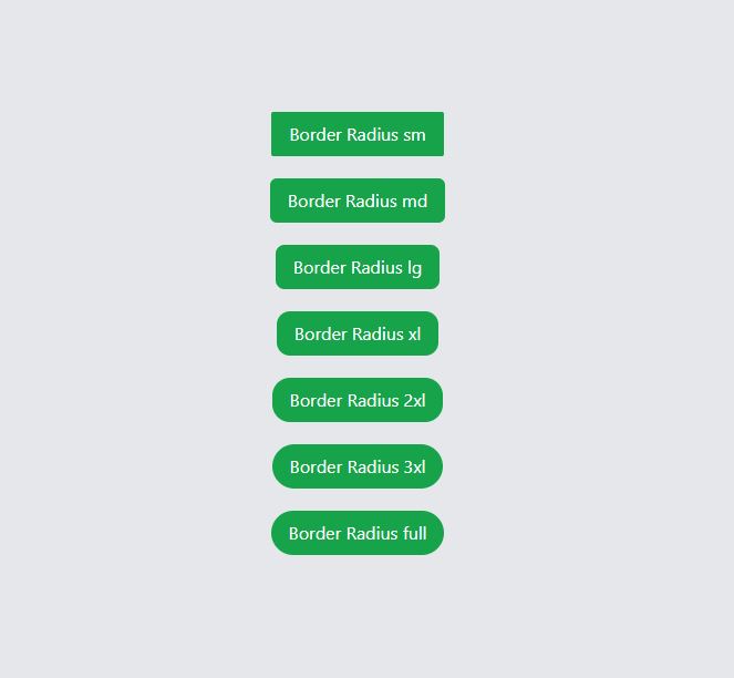
By default, TailwindCSS gives you different classes to round the corners of an element. All these classes start with rounded- and has different values to apply border-raidus. Here is an example of using rounded- classes to apply border-radius in TailwindCSS.
|
1 2 3 4 5 6 7 8 9 10 11 |
<button class="bg-green-600 px-4 py-2 rounded-sm text-white">Border Radius sm</button> <button class="bg-green-600 px-4 py-2 rounded-md text-white">Border Radius md</button> <button class="bg-green-600 px-4 py-2 rounded-lg text-white">Border Radius lg</button> <button class="bg-green-600 px-4 py-2 rounded-xl text-white">Border Radius xl</button> <button class="bg-green-600 px-4 py-2 rounded-2xl text-white">Border Radius 2xl</button> <button class="bg-green-600 px-4 py-2 rounded-3xl text-white">Border Radius 3xl</button> <button class="bg-green-600 px-4 py-2 rounded-full text-white">Border Radius full</button> |
You can check the working example on tailwindcss playground. And here is the screenshot of the output.

Using Separate Border-Radius in TailwindCSS
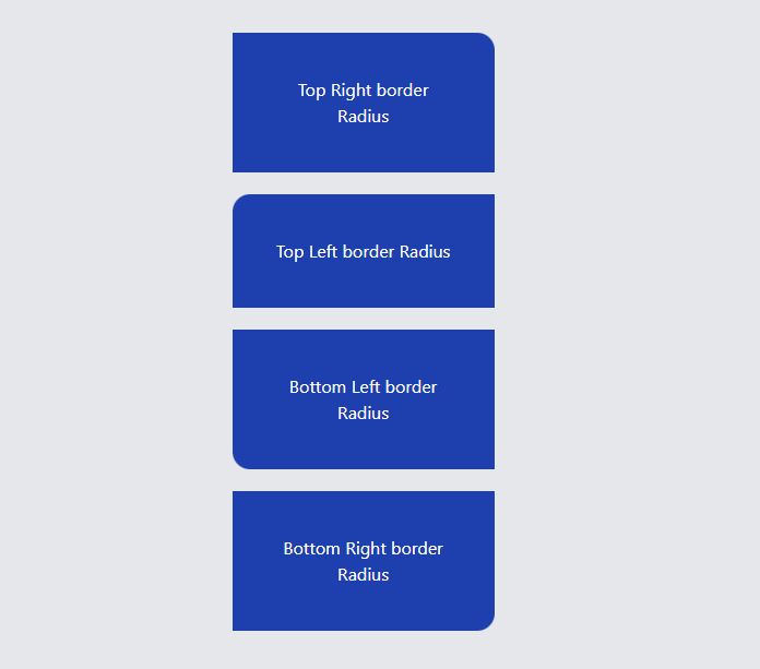
You can also use the separate border-radius to style the different corners of an element. This will not make rounded corners on every side but to only you want to apply. Here is an example of using separate border-radius for top-right , top-left , bottom-left and bottom-right.
|
1 2 3 4 5 6 7 8 9 10 11 12 13 14 15 16 |
<div class="w-60 text-center p-10 h-40 rounded-tr-2xl bg-blue-800 text-white "> Top Right border Radius </div> <div class="w-60 text-center p-10 h-40 rounded-tl-2xl bg-blue-800 text-white "> Top Left border Radius </div> <div class="w-60 text-center p-10 h-40 rounded-bl-2xl bg-blue-800 text-white "> Bottom Left border Radius </div> <div class="w-60 text-center p-10 h-40 rounded-br-2xl bg-blue-800 text-white "> Bottom Right border Radius </div> |
By using the above code, you can make separate rounded corners of your choice. This is very useful when you are working with different shapes. Here is the online example and the output is attached below.

Conclusion
By default, you can use the provided classes to add border-radius in TailwindCSS. These classes are rounded-sm, rounded-md, rounded-lg, rounded-xl, rounded-full etc. But, if you want to have separate border-radius in TailwindCSS, you can use classes like rounded-tr-md, rounded-tl-md etc.